Brands
Fitting Fêtes Branding
Wedding designer and planner Justina Michaels of Fitting Fêtes wanted a new logo to better reflect the style and philosophy behind her company.
So much had to be reflected in the new design—in particular, a balance between the creative finesse she brings to the table with her fine art background, and her detail oriented, fastidious ability that can be counted on. I knew that the wispy, overly romantic lettering present in many wedding industry logos would not be the direction we would be going with Fitting Fêtes. In fact, an intentional rhythm in the strokes of the letters offers a sense of practicality and calm.
With Justina's affinity for all things France (she got her wedding planning start in Paris!) I thought it was important to capture this in the logo itself. I drew inspiration for the letterforms from French Ronde; a lettering style from the 16th century that was used as a basis to teach cursive in French schools. It allows the logo to inherently feel French, without drawing on obvious stereotypes.
After numerous sketches to figure out the composition and concept, the logo was written in calligraphy with a broad-edged dip pen and ink, then fine-tuned by hand, before being digitized.
The final result is a logo that feels established, exudes a sense of effortless elegance, all while being rooted in the traditions of French charm and romance.
Designs: Logo and style guide, business cards, note cards
Client: Fitting Fêtes

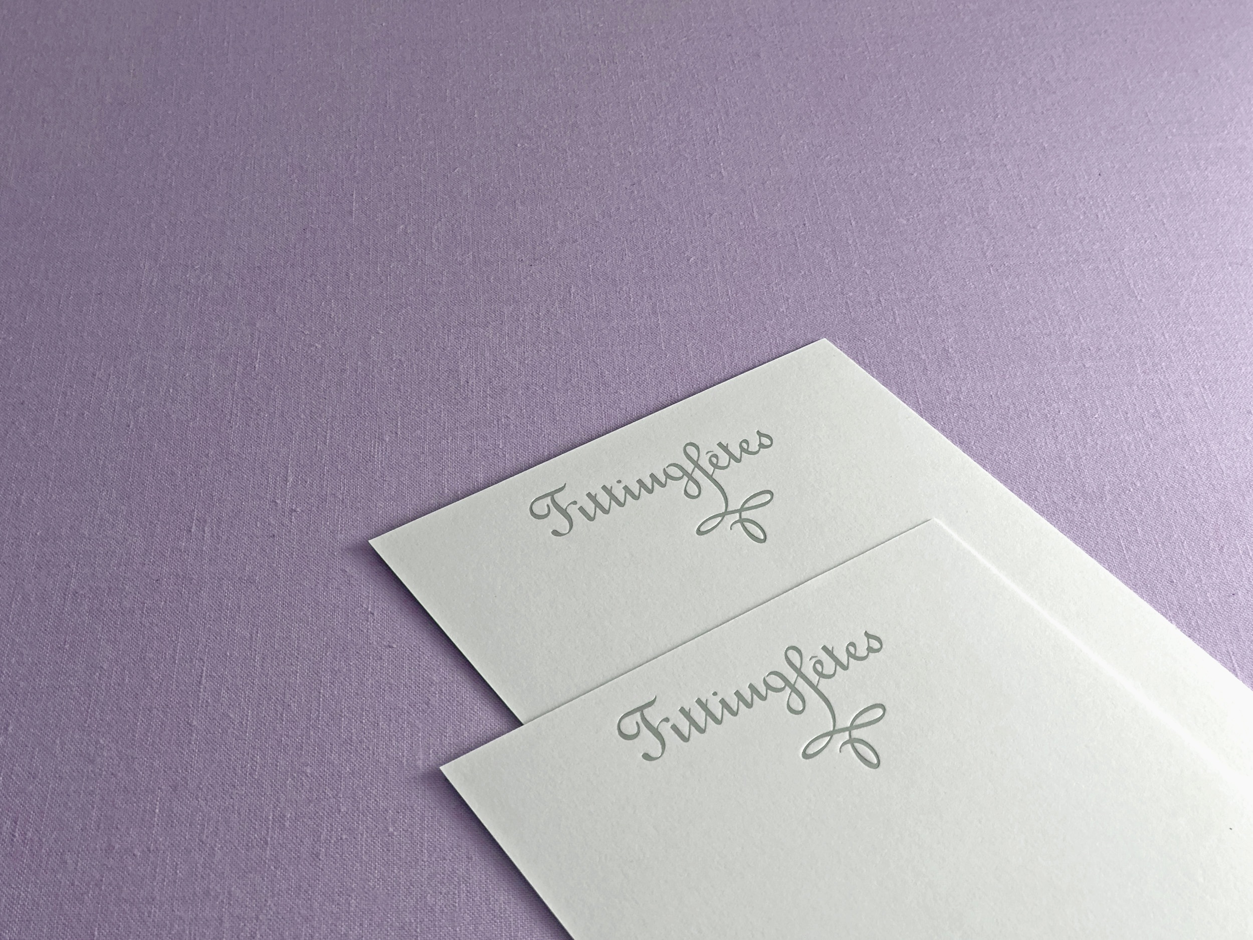
Note cards with logo in matte silver foil stamp on cotton paper


Duplexed business cards with letterpress printed two-color logo and offset printed reverse side